Sunday, May 3, 2020

Week 14

This week I began working on my final project, which is a website. I started out with expanding upon my font beforehand though. I added more punctuation marks, and then I added three Unicode glyphs which were a warning sign, radiation sign, and biohazard sign. I thought these were fitting for the aesthetic of my font. I then converted it into a web font so it could be used on my site.


The second thing I had to do before beginning my site was create an animation. In Adobe After Effects, I converted the font into outlines and made an animation of the letters being traced and filled in. I exported this as an MP4 to later include in the site.


For the site itself, I made three sections. The first gives an introduction, the second allows the user to easily copy the special glyphs without having to look them up, and the third is just a text box which lets you test the font. Once everything was properly laid out and responsive, I decided to include a dark mode feature as well. This was accomplished through JavaScript.

HTML


CSS


JavaScript

Sunday, April 19, 2020

Week 13

This week I put together my manifesto site using the knowledge I learned about media queries. The fonts used in this site were Raleway in regular and bold for headers and Source Code Pro for the body copy. I used the html span tag to emphasize certain words in color in each of my three points that I talk about. For mobile testing, I used Chrome's Dev tool to simulate different screen resolutions and make adjustments accordingly. Once my site was built and everything was responsive, I went back in and added webkit animations as well as a custom cursor through scripting. I really wanted this to be a site that was both an interesting read and fun to interact with.


Final Project Proposal

For this project, I intend to create a website that utilizes the font I created. The website will serve as an introduction to the font and will provide a download link. When visitors view the site, they will be greeted by a short animation featuring the name of the typeface, ‘Amateur Blueprint’. Afterwards, they will scroll down and read about what inspired it, possible use cases, and optimal sizes for reading it. Below the body text will be a text box that allows users to test the font before they decide to download. Provided I have enough time, I may also create additional glyphs for my font and expand upon it.

Monday, April 6, 2020

Week 12

This week there were 3 web typography exercises I completed. The first was about using web fonts to easily change typefaces on a web page. The two fonts I chose for this assignment were 'Righteous' for the headers and 'Fauna One' for the body copy. Another was about the different classifications and gave insight as to where to find quality fonts online and how to organize your collection. The last and most tedious exercise was creating a responsive web page with three different states using media queries. I learned that media queries can set different page properties based on the size of the browser window. That means if you are on a device with a smaller screen, your page will size itself accordingly and rearrange content.


Tuesday, March 31, 2020

Week 11

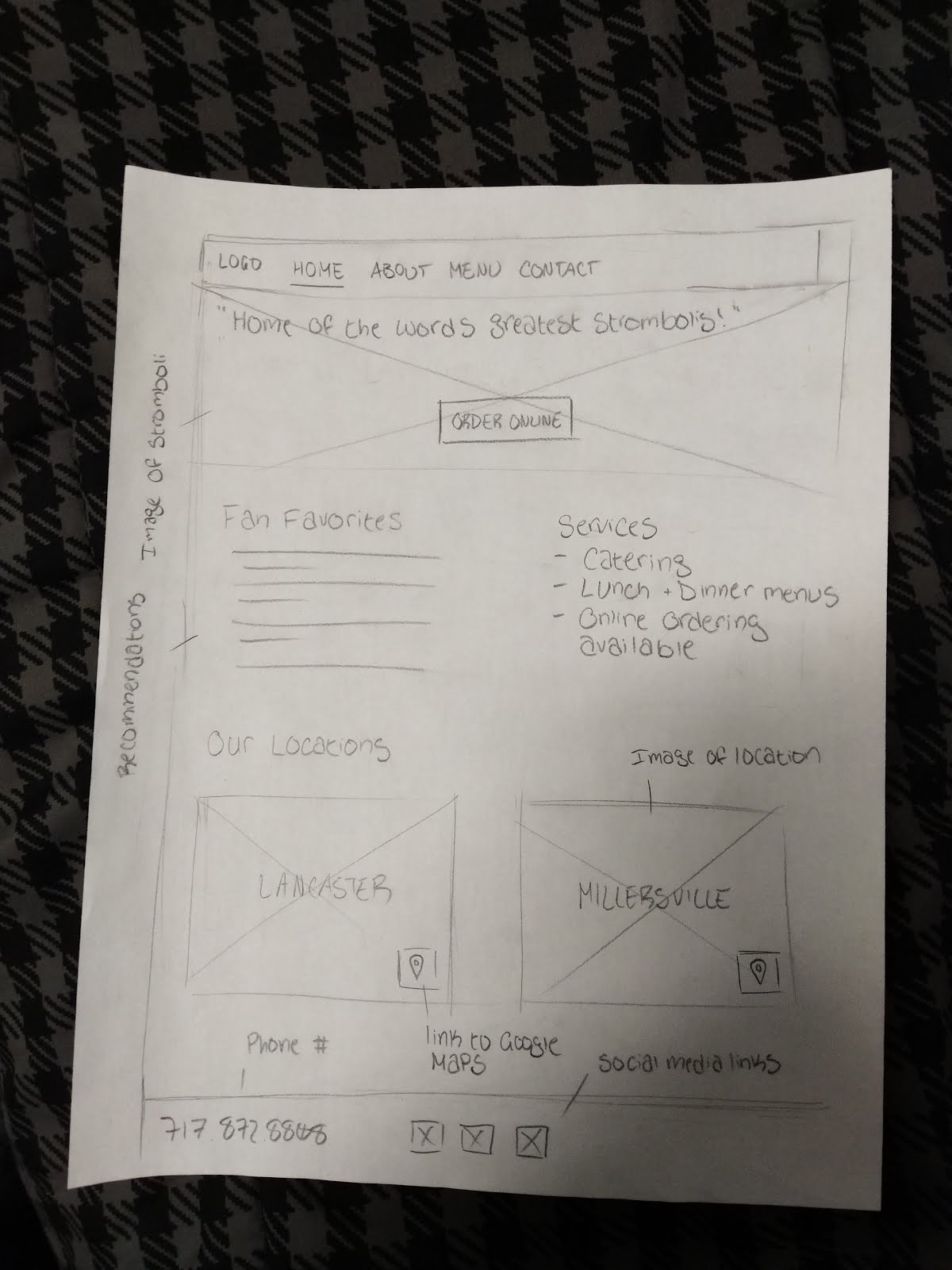
This week I began planning the site for my manifesto. Below are some sketches of layouts I might be using.


I also watched three of the videos from Adobe's Summit 2020 conference. In the introduction video, Mr. Narayen talked about how the economy is currently changing, with a shift towards eCommerce. He explained that Adobe just developed a tool called the "Digital Economic Index" which can be used to visualize inflation and deflation of prices. He also talked a bit about digital experiences as a whole. He said, "People buy experiences, not products." I completely agree with him. Consumers are more likely to opt for products and services that feel personal and tailored to their needs. The one they choose to pay for might not even be the best fit for them, it just has to feel that way.
In the second video, Mr. Chakravarthy introduced the Adobe CXM Playbook. The book is basically a blueprint for running a successful business. The goal is to help growing businesses evolve and adapt to the needs of their customers. Tom Brady made an appearance in this video to talk about playbooks in football which was interesting, but I found it irrelevant. They were obviously using him to promote their service when in reality, he hadn't even used it nor would he have a need for it. It would be more convincing to hear from the perspective of a business that had utilized Adobe's Playbook and seen results.
Chakavarthy talked in another segment about the Adobe Experience Cloud. He explained that customer data is studied by artificial intelligence to optimize customer experience. Adobe has made these technologies available to companies like Microsoft and Opennow so they can better understand their billions of customers through data. In addition, they've made an AI publicly available that is capable of targeting ads towards potential customers.

Tuesday, March 10, 2020

Week 8

Today I started drafting a list of ideas to put in my manifesto using the template provided. Below I've listed the items I have so far.

I love...
  1. Helping others
  2. Creating
  3. Music
  4. Video games
  5. Reading
  6. Cleaning
  7. Sleeping
  8. Sharing knowledge
  9. Sharing my opinions
  10. Working on my car
  11. Fast food
  12. Watching the sunset
  13. Hearing a good story
I believe...
  1. Karma is real
  2. You can create your own meaning in life
  3. Time is relative
  4. IQ isn't an accurate measurement of intelligence, (but it's the best we've got)
  5. Talent isn't something you're born with
  6. Hard work pays off, but not always how you expect it to
  7. Every mistake is a learning opportunity
  8. Things are never just black and white
  9. There's a thin line between confidence and arrogance
I am committed to...
  1. Working smarter not harder
  2. Avoiding conflict
  3. Trying to become a better person
  4. Being true to my word
  5. Learning new things
  6. Hearing out people I disagree with (but still disagreeing)
  7. Finding uses for anything unwanted
  8. Doing something different everyday
I've decided to write my manifesto about cleaning and how it can improve every aspect of your life. I'll explain how ha
CSS Float Exercise

I created a pyramid of colored blocks in CSS to practice using the float and clear properties.

Thursday, March 5, 2020

Week 7

For this virtual assignment, I selected the word 'astonishing' because it could be interpreted in many different ways. I then searched through Google Fonts until I found a few that worked well with the word and began coding. Below are screenshots of my work space.

Tuesday, February 25, 2020

Week 6

Delanie and I began our search for web fonts today and settled on Modak for the headings and Istok Web for the body copy. We also picked a warm color palette with earthy tones. However, after receiving feedback we decided to change our header font to one called "Spicy Rice" because it was easier to read. Due to our limit of 3 graphics for the page, we utilized borders and color variation to make the content more interesting.


Tuesday, February 18, 2020

Week 5

Once my font was properly kerned, I exported the OTF file so it could be used on other computers and shared the link. I also printed a physical copy of the type specimen on 11x17.
Afterwards I began the initial planning for the redesign of the Sugarbowl's website. Delanie and I worked on wireframes, and came up with a few possible color palettes.


https://coolors.co/0f0a0a-cc3f0c-f5efed-f7c35b-2292a4

Wednesday, February 12, 2020

Week 4

After completing the lowercase set of characters for my font, I started putting them into the Fontself Maker extension, and mapping them out. Some turned out well, and others did not. It became clear to me which letters needed to be revised after seeing them at such a small scale.


Thursday, February 6, 2020

Week 3

This week I decided on a typeface to further develop, and planned out the rest of the characters in it. The one I picked was inspired by architectural drawings and has a sketchy, angular appearance to it. In order to vectorize my font and put it into the template, I first had to adjust the levels in Photoshop to make it darker. Then I used Illustrator to trace the image and smooth out the curves.


Tuesday, January 28, 2020

Week 2

Our second project is to design three typefaces that will be used in a future project. In preparation, we are to format the same body copy for film, phone, and web. This exercise gave me a better feeling for how type is designed to be used in different contexts.

From the articles I read, I learned that typography on the web has come a long way in the past decade. Originally, there were only 10 basic fonts that could be used on the web because they had to be already present on the user's computer. I also learned that it is now incredibly easy to create your own fonts to be used digitally. I didn't realize that digital fonts had existed as early as the 1960s either. It was especially useful to learn about the variety of sites that fonts can be obtained from, because previously I was only aware of Dafont, Adobe Typekit and Google Fonts. Now I have an even greater variety to choose from.

After doing a bit of research, I've begun prototyping my own typeface. For my first concept, I opted for a geometric style.


Thursday, January 23, 2020

Week 1

Today I interacted with each of my cube mockups to see which worked the best. Once I decided, I began assembling the text in Illustrator and experimenting with the font weight. The three levels I picked were light, semibold, and bold. Anything lighter or darker looks a bit extreme for this typeface.